

If you've ever wondered how a traditional summer festival can suddenly become a viral art story, here's where you'll find the answer. The brochure does more than explain a 祭り (matsuri, festival) schedule; it pulls people into the visual world around one of Tokyo's most important shrines.
Sannō Matsuri comic brochure and the Akasaka Hie Shrine connection
Know that feeling when a festival pamphlet stops you in your tracks? That's exactly what happened with the Sannō Matsuri comic brochure from Akasaka Hie Shrine in Tokyo. The piece spread fast on X because it doesn't look like a routine event leaflet. It looks polished, cinematic, and expensive.
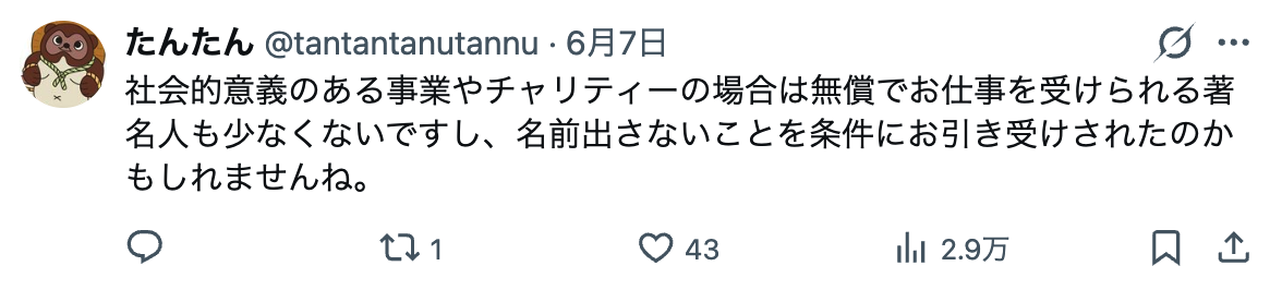
The Sannō Matsuri itself is one of Tokyo's three great festivals, along with Kanda Matsuri and Fukagawa Matsuri. It's held by Hie Shrine in Akasaka, near the political heart of the city. The shrine is famous for its staircase with red 鳥居 (torii, Shinto shrine gate) gates, which already gives the place a strong visual identity. So when a festival brochure arrives with this level of art direction, it feels completely in character. Classic Japan, isn't it?
Here's the deal: the brochure isn't just decorative. It helps visitors understand the festival's schedule, rituals, and procession details, while also giving the event a modern visual hook. That balance matters. Japanese festivals are old, but they're also living public culture, and a good brochure can make that easier to approach. If you're learning Japanese, this is also the sort of material that quietly teaches you vocabulary through context, from matsuri and 神輿 (mikoshi, portable shrine) to the more specific language of shrine events.
Compared with back home, festival brochures in Japan often feel like miniature cultural artefacts. They're practical, yes, but they also reflect taste. And when a shrine like Hie treats its printed material with this much care, you start to see how seriously presentation is taken here. Personally, I love that. It turns an announcement into an object worth keeping.
Why the brochure went viral on X
Plot twist: the artwork itself became the story. Once images of the brochure circulated on X, people did what people always do with striking Japanese design, they zoomed in, reposted, and started asking who made it. The reaction was instant, because the illustrations looked like professional manga or premium editorial art, not something you'd expect from a shrine event guide.
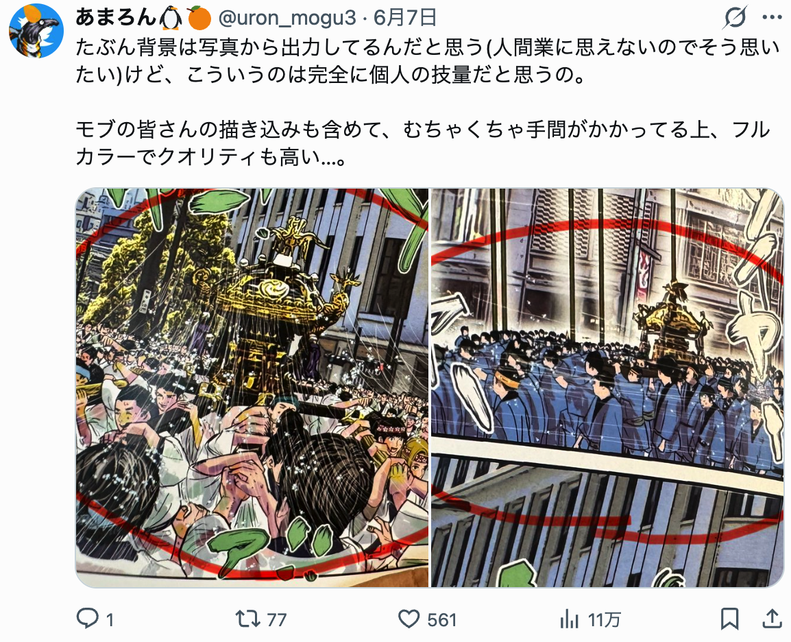
That contrast is what made it spread so quickly. A traditional festival brochure is supposed to be informative. This one also looked collectible. The linework is crisp, the composition is controlled, and the characters have real movement. You can feel that the artist understands how to guide the eye across a page, which is harder than it looks.
Trust me on this one: once a Japanese visual item gets attention on X, the comments become part of the experience. People weren't only praising the artwork, they were comparing it to commercial manga, guessing whether it came from a famous illustrator, and wondering if the shrine had somehow commissioned a hidden star. That uncertainty fuelled the frenzy. The identity of the artist became a puzzle, and puzzles travel well online.
Here's the catch: viral attention can flatten the actual context. A lot of posts focused only on the art, while the brochure also serves a very specific local and religious function. It is tied to a real festival, at a real shrine, with a real community around it. That tension, between internet spectacle and on-the-ground tradition, is what makes this story so good. The art is what grabbed people. The festival is what gives it depth.
The artist mystery and the power of pro-level illustration
Quick detour: why does artist anonymity matter so much here? Because Japan has a long habit of letting strong work speak before the creator does. Of course, in commercial publishing and social media that changes fast, but the emotional reflex remains. When a piece looks this polished, the first response is often not just admiration. It's detective work.
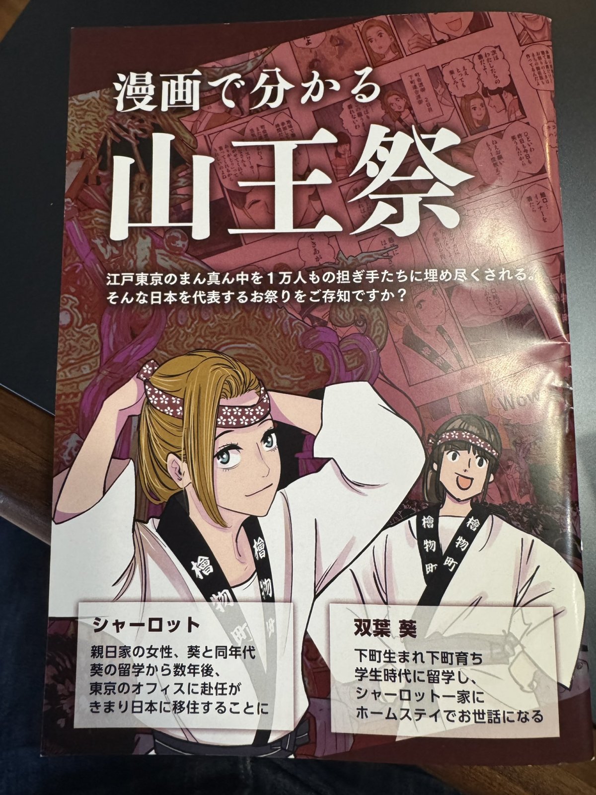
In this case, the conversation on X revolved around the possibility that the illustrator could be a well-known manga artist, a seasoned commercial designer, or someone with serious industry experience. That speculation tells you something important about the work itself. People don't assume this level of control, dynamism, and finish comes from an amateur. The pages look designed by someone who understands face angles, costume rhythm, negative space, and print readability. That's why the identity question took off.
What makes the artwork feel so strong
My tip: look at the brochure like an art editor would. First, notice the contrast between the clean festival information and the almost comic-book intensity of the illustrations. Then look at how the imagery frames the shrine setting without overwhelming it. Finally, notice the pacing. The art doesn't shout on every page. It lets the festival breathe, which makes the strongest panels hit harder.
I especially like the way this kind of brochure sits between worlds. It isn't a manga volume, not an advertising flyer, and not a formal shrine document. It's all three, a little bit. That hybrid quality is very Japanese to me, in the best sense. It respects format, but it also knows when to surprise you. And that's why people kept sharing it. Really impressive.
For Japanese learners, there is a quiet bonus here too. Materials like this are great for picking up culturally grounded words in context. If you see terms like お神輿 (omikoshi, portable shrine), matsuri, or 神主 (kannushi, Shinto priest) on a brochure, you're not just memorising vocabulary. You're attaching those words to a place, a season, and an actual event. That makes them stick.

Why this small festival booklet matters beyond the buzz
To be fair, viral posts come and go. But this one is worth more than its moment on X. It shows how much visual culture matters in Japan, even at the level of a local festival handout. It also reminds us that shrine life isn't frozen in the past. It continues through design, communication, and the small decisions that shape how people meet tradition.
That's what I keep coming back to with stories like this. The brochure is a tiny object, but it opens a bigger door. It tells you something about Akasaka Hie Shrine, something about the Sannō Matsuri, and something about how contemporary Japan treats illustration as serious cultural language. If you've been in Japan for a while, you've probably seen this pattern elsewhere too, in station posters, bookstore covers, or exhibition leaflets. The best design often looks effortless. It isn't. It takes real craft.
And that's why I think the artist mystery matters less than the broader response. People saw quality, they felt curiosity, and they wanted to find out more. That chain reaction is very human, and very Japanese at the same time. It starts with a sheet of paper and ends with thousands of people talking about a shrine festival they might never have noticed otherwise. Sounds good, right?
For more stories like this, more Japan news on jpnerd.com.
In pictures

Frequently Asked Questions
What is the Sannō Matsuri brochure?
It is a printed festival guide for the Sannō Matsuri at Akasaka Hie Shrine in Tokyo.
Why did it go viral on X?
People were struck by the high-end artwork and started sharing it widely while guessing who the artist was.
Why does this matter for Japan fans and learners?
It is a great example of how Japanese festivals, design, and public culture come together in one small object.