
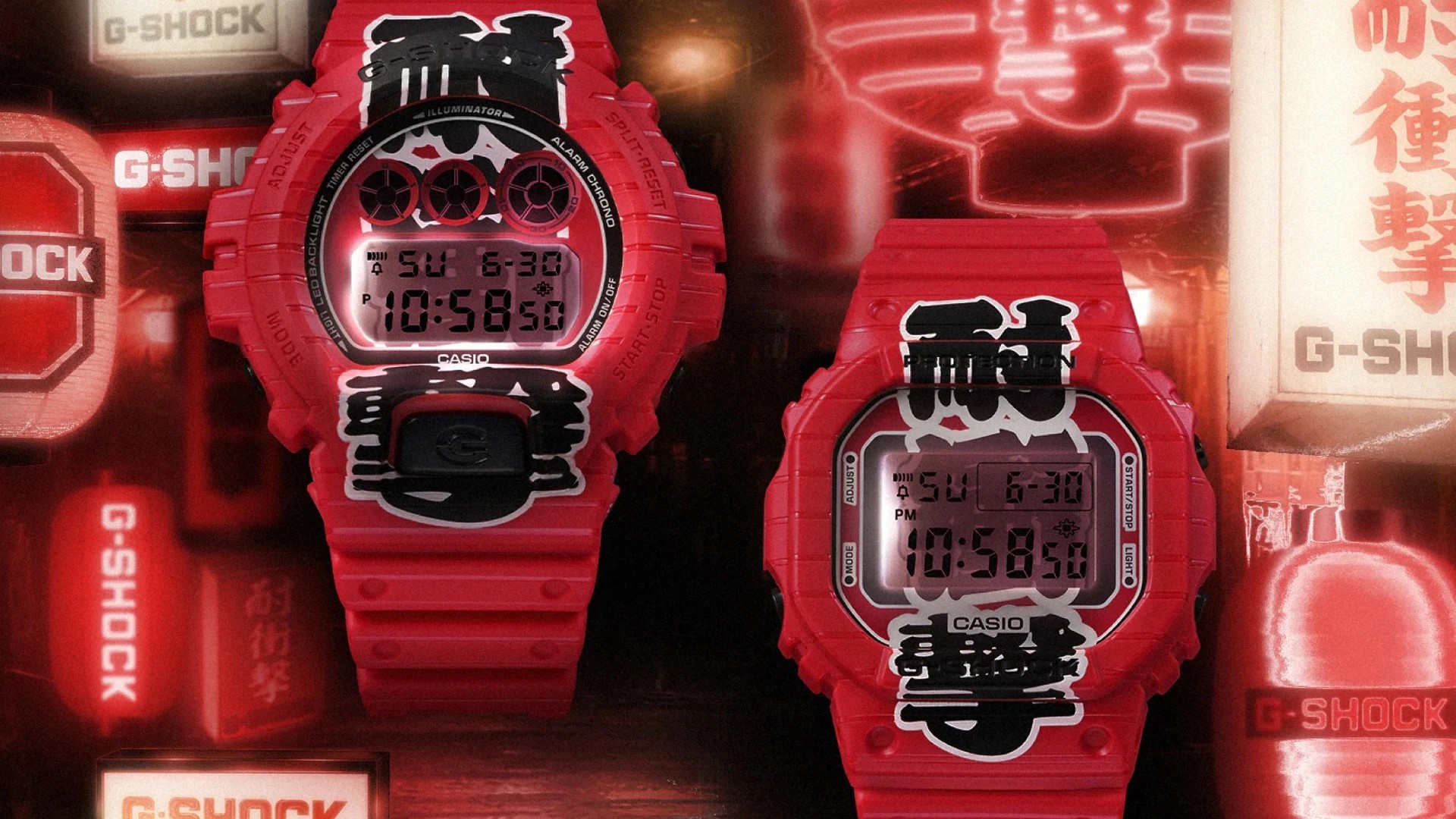
What many overlook is that this isn’t only about a bright case; it’s about how Casio turns a familiar piece of street culture into a wearable design story. Classic Japan, isn’t it?
G-Shock Aka Chochin: a watch inspired by red lanterns
Picture this: a narrow alley in Tokyo at dusk, paper lanterns glowing outside a small 居酒屋 (izakaya, Japanese pub), and red light bouncing off wet pavement. That mood is exactly what the G-Shock 赤 (Aka, red) 提灯 (Chochin, paper lantern) tries to capture, and it does it with far more confidence than a simple red case ever could.
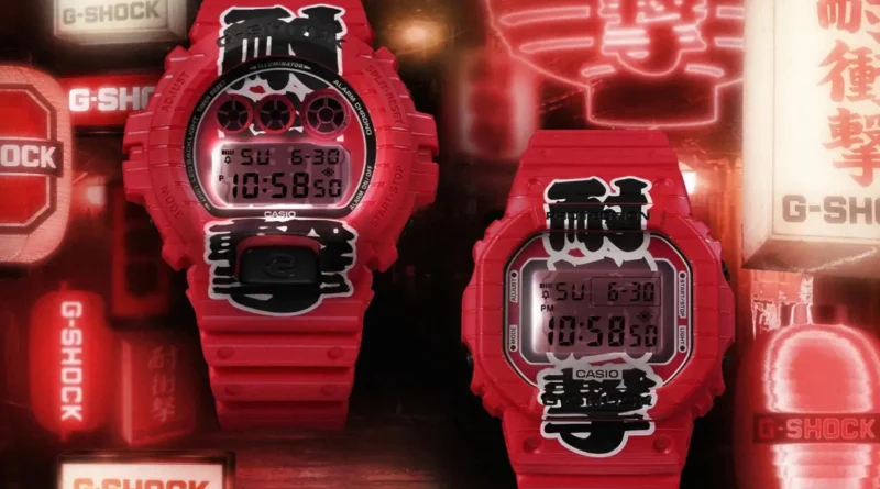
The name itself matters. Aka means red, and chochin refers to a lantern, usually the kind you see hanging outside restaurants, festival stalls, and shrine paths. So the watch isn’t just red, it’s red with a story, and for Japan fans that detail hits hard. But let’s stick with the watch for now.
Red lantern design and why it works so well
Let me show you why the design is getting so much attention. Casio has leaned into a deep, saturated lantern red, the kind that feels warm rather than flashy. That choice changes everything, because on a G-Shock case, red can easily become loud, but here it feels grounded and culturally specific.
What many overlook is that Japanese design often makes colour meaningful, not decorative. Red lanterns in Japan are tied to nightlife, 祭り (matsuri, festival) energy, and that slightly nostalgic city atmosphere you see in places like Asakusa, Kyoto’s old streets, or around local summer festivals. No wonder the colour immediately triggers a scene, not just a style. See what I mean?
Why watch collectors care about the finish
Fun fact: the appeal isn’t only the colour itself, but how it behaves across the different surfaces of the watch. G-Shock designs often mix resin, metal-like textures, glossy highlights, and printed accents, and that interplay is where a themed release can look either cheap or brilliant. In the Aka Chochin, the lantern concept gives the whole piece a clear visual anchor, so the design feels deliberate rather than random.
On the flip side, themed watches can fall apart when the reference is too vague. This one avoids that by staying close to a real object people in Japan instantly recognise. It’s a strong move from Casio, and watch fans usually respect that kind of precision. Sounds good, right?
Kanji details that add real Japanese character
Let’s be honest: the 漢字 (kanji, kanji characters) details are what push this release from cool to memorable. Kanji carries weight, even when you don’t read every character fluently. You see it and you feel language, tradition, and design all at once.
For Japanese learners, this is where the watch becomes more than a fashion item. If you spot kanji like chochin-related references or festival-style typography, you’re looking at a small lesson in how Japan uses writing as visual identity. My tip: don’t just memorise the meaning, notice the shape. On products like this, the brush-stroke style often tells as much of the story as the literal translation. Highly recommended:
Why kanji on products matter in Japan
Imagine a watch face, strap, or packaging using kanji with a strong calligraphic feel. That choice immediately connects the item to summer matsuri, lantern streets, and old-town atmosphere. Japanese brands do this a lot, because writing is part of the design language, not an afterthought.
For learners, that’s useful. You can train your eye to recognise common cultural words like matsuri, izakaya, or chochin, and then connect them to places and objects in real life. That kind of vocabulary sticks much better than flashcards alone. But that’s not all.
Why G-Shock keeps winning with Japan-inspired releases
Imagine a brand that has spent decades turning toughness into style. G-Shock, first launched by Casio in 1983, has become one of Japan’s most recognisable design exports, and it keeps finding new ways to merge function with story. The Aka Chochin fits that pattern perfectly, because it respects the core G-Shock identity while giving collectors something culturally loaded.
What I especially like is that this isn’t a lazy souvenir-style product. It feels closer to an object with context, like something you could imagine seeing in a carefully curated shop in Shibuya, Harajuku, or even a niche watch boutique in Osaka. That balance between pop design and cultural reference is where G-Shock often shines. Classic Japan, isn’t it?
For fans of Japanese language, the watch also shows how much you can learn from everyday design. A single product can teach you a word like chochin, show you how kanji works as decoration, and hint at the mood of an entire season in Japan. That’s exactly the kind of layered detail Japan nerds love, and honestly, it makes the watch more interesting than many technically louder releases. But let’s stick with the essentials for now.
If you enjoy this kind of Japan-focused watch coverage, keep following the details, not just the headline colours. That’s where the good stuff usually hides, and this G-Shock proves it nicely. more Japan news on jpnerd.com
Frequently Asked Questions
What is the G-Shock Aka Chochin?
It is a Japan-inspired G-Shock release with a red lantern theme and kanji details.
Why is the design getting attention?
Because it uses a clear lantern-red look that connects directly to Japanese street and festival culture.
Is there a language learning angle here?
Yes. It is a good example of how Japanese words, writing, and visual design often work together.