Basically, this isn't just a new colour drop; it's Hydro Flask's first Japan-only model, and that makes the launch worth a closer look. If you like Japanese design, drinkware, or simply spotting how global brands localise for Japan, this one's a neat case study.
Hydro Flask Japan exclusive models put colour first
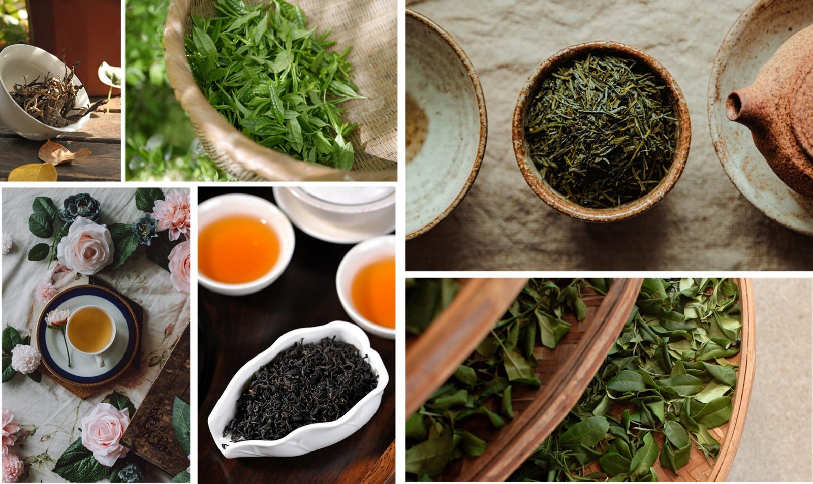
Picture a narrow alley in Tokyo, a small cafe with a wooden counter, and a stainless bottle sitting next to a bowl of iced 抹茶 (matcha, powdered green tea). That kind of scene is exactly where this launch makes sense, because Hydro Flask's new Japan-only release leans hard into colour, mood, and daily usability.
The headline fact is simple: this is the first Japan-exclusive model from Hydro Flask. The brand, best known for insulated bottles and cups, has created two local versions for Japan, the 16oz WIDE MOUTH and the 200ml MICRO HYDRO. What many overlook is that the sizes aren't random. The 16oz WIDE MOUTH is a familiar carry size for long commutes, gym bags, and desk use, while the 200ml MICRO HYDRO fits the smaller, more portable side of Japanese daily life, where compact design often wins.
For Japan fans, that detail matters. Japanese product culture often rewards items that feel considered, not oversized. A bottle that looks good on a train table, in a ryokan room, or beside a 弁当 (bento, lunch box) lunch is doing more than storing water. It's signalling lifestyle. Convinced yet?
Matcha, akane, karashi and the Japanese colour story
Why these three colours work so well
Let's be honest: colour naming is half the appeal here. Matcha, 茜 (akane, madder red; deep red), and 芥子 (karashi, mustard) are all rooted in Japanese visual language, and each one carries a different emotional tone.
Matcha is the easiest to read internationally, but in Japan it's more than a trendy green. It points to tea culture, calmness, and a soft, earthy palette. Akane, on the other hand, evokes a red-orange shade often associated with sunsets and autumn leaves, the kind of colour you notice during a stroll through a temple district in late afternoon. Karashi is the boldest of the three, a mustard-yellow tone that feels a little retro, a little playful, and very Japan in the way it can be both practical and stylish at once. Pretty striking.
Quick detour: Japanese colour names often do cultural work that English colour names don't. They suggest season, texture, and atmosphere, not just hue. If you're learning Japanese, this is a nice reminder that words like akane and karashi aren't only labels, they're mood setters. That's a useful kind of vocabulary, because Japanese often blends language, seasonality, and design into one experience. Insider tip: pay attention to colour names in product launches; they tell you a lot about what the brand wants to borrow from Japanese culture.
Hydro Flask's first Japan-only release feels very local
Before I forget, localising a global brand for Japan isn't new, but doing it with a clear Japanese aesthetic concept is a stronger move than simply adding a cherry blossom print and calling it a day. This launch feels more thoughtful than that. Instead of shouting for attention, it uses restrained colour, everyday shapes, and a product mix that suits real routines in Japan.
Hydro Flask has built its reputation in the US and beyond on insulation, durability, and a casual outdoor feel. In Japan, though, the same brand language gets filtered through a different lifestyle lens. People here often care about compactness, visual harmony, and how an object looks in a bag, on a desk, or at a cafe. The 16oz WIDE MOUTH serves the familiar daily bottle role, while the 200ml MICRO HYDRO feels closer to a small personal accessory. That split is smart, because it covers two habits at once.
Seriously though, this is where the launch gets interesting from a Japan branding perspective. The company isn't just selling a product in Japan, it's acknowledging that Japan has its own design expectations. A first Japan-only model says, quietly but clearly, that the local market isn't an afterthought. For a US brand, that's a meaningful signal. Classic Japan, isn't it?
What Japan fans and language learners can take from this release
The first time I went to Japan, I was surprised by how often daily objects seemed chosen with the same care as clothes or food. A bottle, a cup, even a lunch box can feel like part of your personal style. This Hydro Flask release taps into that same idea, and that's why it stands out beyond simple merch news.
My tip: if you're learning Japanese, use product launches like this as reading practice. Try identifying the colour words first, then look at the size names, then notice how the brand frames its Japan release. It's a small exercise, but it teaches you how Japanese consumer culture often links language, design, and seasonality. You don't need advanced grammar for that, just curiosity and a good eye.
What I especially like is that the whole concept feels easy to imagine in real life. Matcha for morning commutes, akane for an autumn walk, karashi for a desk companion that adds a bit of brightness to the room. That's not just branding, that's everyday atmosphere. My verdict: this is the sort of Japan-local release that feels made for people who love both function and style.
For more stories like this, see more Japan news on jpnerd.com.
Frequently Asked Questions
What is special about this Hydro Flask release?
It is the first Japan-exclusive model from Hydro Flask, with colours and sizing tailored to local tastes.
Which products are included?
The release includes the 16oz WIDE MOUTH and the 200ml MICRO HYDRO.
What do the colours mean?
Matcha suggests tea culture and calmness, akane feels warm and seasonal, and karashi adds a mustard-yellow accent.