If you like character art with a strong Japan-inspired mood, this one’s worth a closer look. It’s the kind of concept that makes you think about how much atmosphere a single skin can carry.
![Dragon Ball Z: Kakarot [Master Edition]](https://s.pacn.ws/1/p/1eh/dragon-ball-z-kakarot-master-edition-908785.1.jpg?v=t8ja8t&width=400)

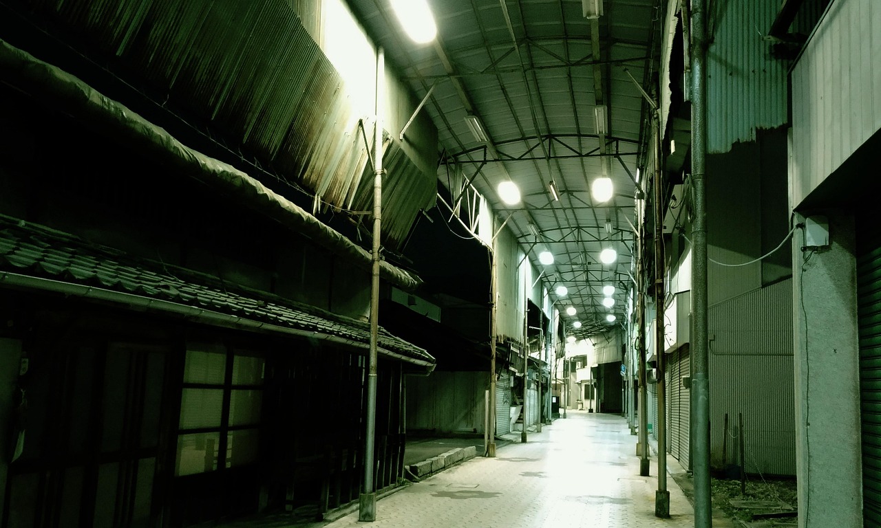
No joke: 祭り (Matsuri, festival) Street Clancy feels like a character concept built around one perfect summer night. The Supercell Make submission takes Clancy out of a plain battleground and drops him into a matsuri setting, where paper lanterns glow, stalls line the street, and the whole scene feels like it’s waiting for 太鼓 (taiko) drums and festival cheers.
What I especially like is how the design doesn’t just borrow a few Japan-themed props. It commits to the atmosphere. You get a street festival mood, a winner’s presence, and a lantern trophy that makes the character look like he’s already earned his place at the centre of the crowd. Sounds weird, but it’s true. This is exactly the kind of visual storytelling that makes Supercell Make so fun to watch.
Speaking of which... Supercell Make has become a great playground for fan artists who want to turn game characters into full-blown concepts. The platform lets creators submit skins, and the community reacts to them, which means the best ideas need more than flashy colours. They need a clear identity. Matsuri Street Clancy has that in spades, and the Japanese festival angle gives it a strong hook for Japan fans and language learners alike. If you’ve ever heard words like matsuri, 提灯 (chouchin, paper lantern), or 屋台 (yatai, street stall), this design immediately clicks.
Supercell Make and why this Clancy concept stands out
Supercell Make is more than a gallery of fan art. It’s a living idea lab where players submit visual concepts for Supercell characters, and the community gets to imagine what could actually fit inside the game. That matters, because a strong submission has to feel playful, readable, and game-ready all at once.
Here’s the kicker: Matsuri Street Clancy doesn’t rely on complicated lore to make an impression. It uses a straightforward festival street setup, then layers in one central win-condition symbol, the lantern trophy. That keeps the silhouette clean and the story easy to read. For a character skin, that’s gold.
And it gets better: the winner motif adds a nice little emotional layer. Instead of just being “festival Clancy,” the design suggests celebration after a contest, parade, or local event victory. You can almost picture him walking past yatai with a prize in hand, while the crowd cheers around him. From my experience, that sense of momentum matters a lot in character design, because it gives fans something to imagine beyond the pose itself.
Matsuri street scenery, lanterns, and Japanese festival energy
Guess what? The matsuri setting is doing a huge amount of heavy lifting here. In Japan, summer festivals are often associated with warm evenings, strings of chouchin lanterns, goldfish scooping, shaved ice, and that busy, slightly chaotic street feeling where every stall seems to call your name. This concept captures that vibe well, even without needing a full background story.
Why the street scene works so well
What many overlook: festival backgrounds are not just decoration. They tell you about timing, mood, and social energy. A matsuri street usually feels temporary, lively, and crowded, which is perfect for a character skin that wants movement and personality. The visual language is instantly recognisable, and that helps even viewers who don’t know Japanese culture deeply.
A great example: if you’re studying Japanese, this design gives you a neat vocabulary anchor. Matsuri means festival, chouchin means lantern, and yatai refers to a street stall. Those words are easy to remember when they’re tied to an image, not just a flashcard. My tip: use designs like this to build memory hooks. A single visual can make a word stick far faster than rote study. Convinced yet?
Oh, almost forgot: the colour mood matters too. Festival art usually leans into warm reds, bright yellows, and nighttime contrasts, because those shades immediately suggest celebration. If Clancy is framed by lantern light, the whole skin feels alive, almost like you’re standing in front of a summer matsuri poster rather than a game character page. Highly recommended: pay attention to how these colours affect your first reaction.
The lantern trophy and winner motif give Clancy a story
I still remember exactly how often the best fan concepts are the ones that tell you “what happened just before this moment.” Matsuri Street Clancy does that with the lantern trophy. It’s not just a random prop, it’s a symbol of achievement, and it turns the character into a festival champion rather than just a festival attendee.
That winner motif is smart because it adds contrast. Festivals are about shared fun, but trophies are personal. Put the two together and you get a character who feels both local and victorious, which is a stronger design idea than either element alone. The visual is cheerful, but there’s also pride in it. That little tension makes the concept memorable.
While we're at it: the lantern trophy also fits Japanese festival imagery in a subtle way. Lanterns are common in summer events, shrine approaches, and neighbourhood celebrations, so using one as a prize feels playful without losing cultural connection. It’s not trying too hard, and that restraint is part of the charm. From my experience... the best themed skins are the ones that know when to stop.
Why Japan fans and language learners should pay attention
Picture this: you’re browsing fan art, and one design gives you a whole mini lesson in Japanese culture, visual design, and vocabulary. That’s the sweet spot for Japan fans. Matsuri Street Clancy does exactly that, because it turns a festival into a character identity instead of using it as a simple backdrop.
For learners, this kind of concept is useful because it connects words to context. If you already know matsuri, you’ll notice how the whole scene supports that term. If you’re newer to Japanese, the design still helps you learn the rhythm of festival culture, from street stalls to lanterns to the winning-prize feeling that often shows up in local competitions and event games. A visual like this makes cultural memory easier.
Here’s the kicker: fan-made game art can be a surprising study aid. You’re not just looking at a character, you’re reading a visual sentence. Matsuri Street Clancy says “celebration,” “street festival,” and “winner” all at once. That’s a lot of meaning packed into one image, and it’s why the concept stands out inside the Supercell Make crowd. Sounds good, right?
Frequently Asked Questions
What is Matsuri Street Clancy?
It is a Supercell Make fan concept that gives Clancy a Japanese festival street theme with lanterns and a victory mood.
Why does the design feel so strong?
It combines a clear setting, a readable character silhouette, and a lantern trophy that suggests a winner’s story.
Is this useful for Japanese learners?
Yes, because it naturally connects visual memory with words linked to festivals, lanterns, and street stalls.