What makes it fun is the mix of visual storytelling and clear character identity. Blizzard isn’t just swapping colours here; it’s leaning into a collaboration that feels tailored for players and music fans alike.
![Dragon Ball Z: Kakarot [Master Edition]](https://s.pacn.ws/1/p/1eh/dragon-ball-z-kakarot-master-edition-908785.1.jpg?v=t8ja8t&width=400)
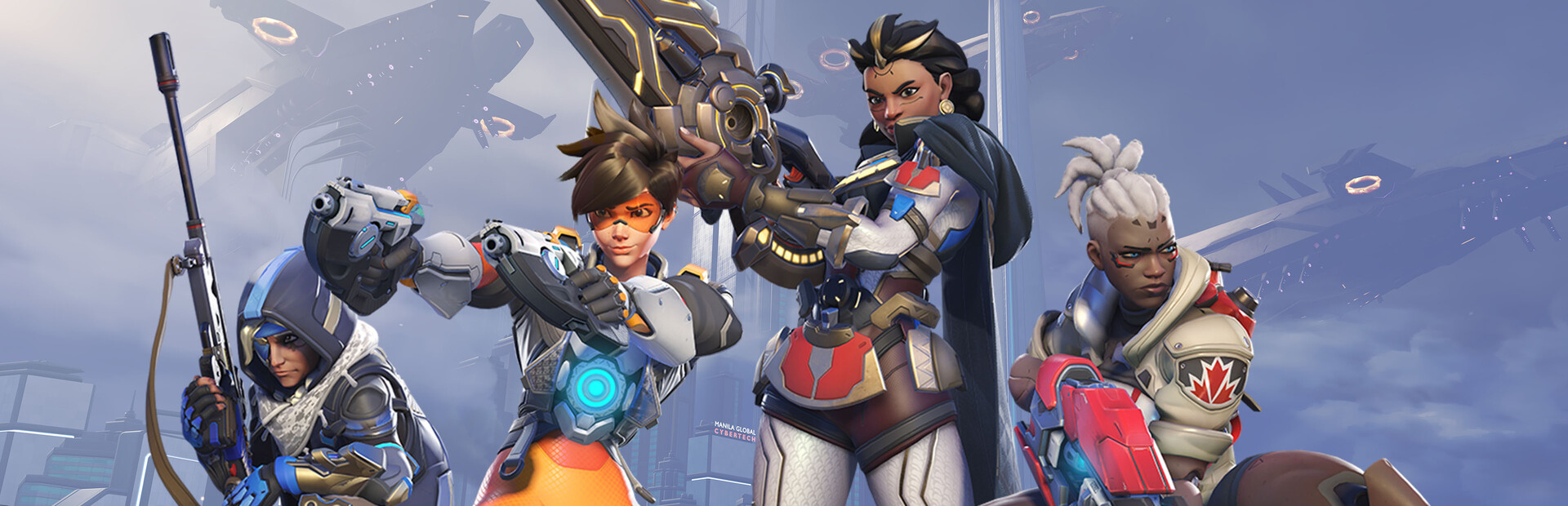
Know that feeling when a game collab actually looks thought-out? That’s the vibe here. Overwatch has teamed up with YOASOBI for six skins, and the result is less “logo slapped on top” and more “someone cared about the design language.”

For Japan fans, this is also a small culture bridge. YOASOBI is one of the biggest names in modern J-pop, known for turning fiction-based songs into polished, emotional tracks, while Overwatch has long been Blizzard’s team shooter with a very visible style identity. Put them together, and you get a crossover that makes sense visually and commercially. Wait, there’s more.
Overwatch x YOASOBI: what the six skins are really doing
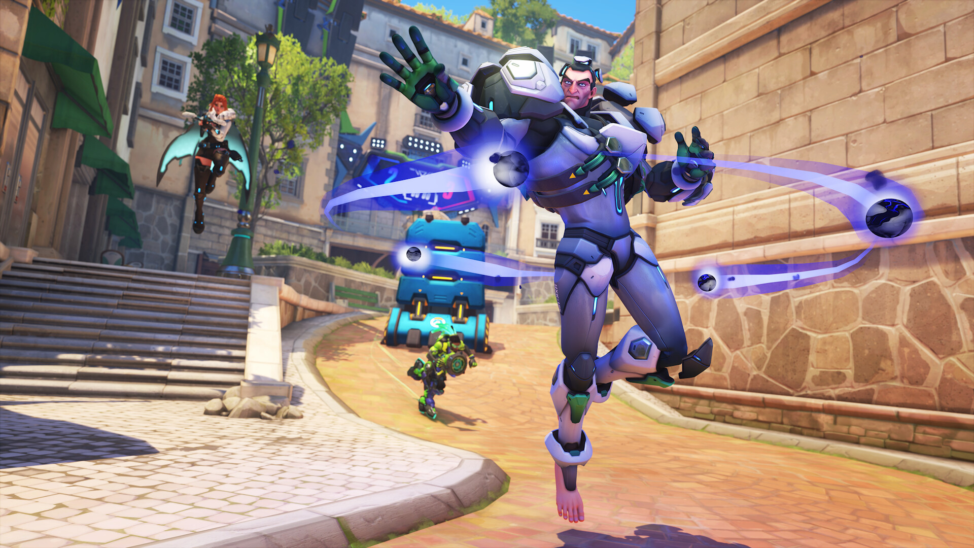
Did you know crossover skins often matter more than the gameplay update around them? That’s because skins are where a brand can be playful, specific, and instantly recognisable. In this case, the six skins are the main event, and they’re built to give different heroes a YOASOBI-flavoured makeover without losing the original silhouettes.
Basically, the appeal is cosmetic precision. Fans are looking for details such as colour palette, stage-inspired elements, hair styling, accessory choices, and a costume shape that still reads clearly in-match. No exaggeration, that balance is what separates a good collaboration from a forgettable one. See what I mean?
Why six matters
What many overlook is that six isn’t random. It gives Blizzard enough room to spread the collaboration across several heroes, which helps the crossover feel like a mini event rather than a single premium drop. That usually means more player attention, more social media sharing, and more chances for fans of one side to discover the other.
Insider tip: when a collab has multiple skins, the excitement often comes from comparing how each hero’s base design is adapted. Some heroes suit sleek fashion styling, others need bolder shapes, and that contrast is half the fun. Personally, I always enjoy the ones that keep the character readable from a distance, because that’s where good skin design shows up in actual play. Personally...
YOASOBI and the J-pop angle in gaming culture
What most people don’t know is that YOASOBI’s name is tied to the idea of “playing at night”, and that gives the collaboration a subtle mood that fits gaming surprisingly well. Their rise has been fast and very public, with breakout songs like Yoru ni Kakeru making them a familiar name far beyond Japan. That matters here, because Overwatch isn’t just borrowing a sound, it’s tapping into a very current piece of Japanese pop identity.
While we’re at it, J-pop has become a regular language point for learners, especially words like 歌 (uta), 音楽 (ongaku, music), and 世界 (sekai, world), which keep showing up in song titles, fan talk, and music coverage. A collab like this is handy for learners because it gives real context, not textbook examples. If you’re studying Japanese, that’s gold, because cultural memory makes vocabulary stick. Sounds weird, but it’s true.
Cosmetic details fans will care about
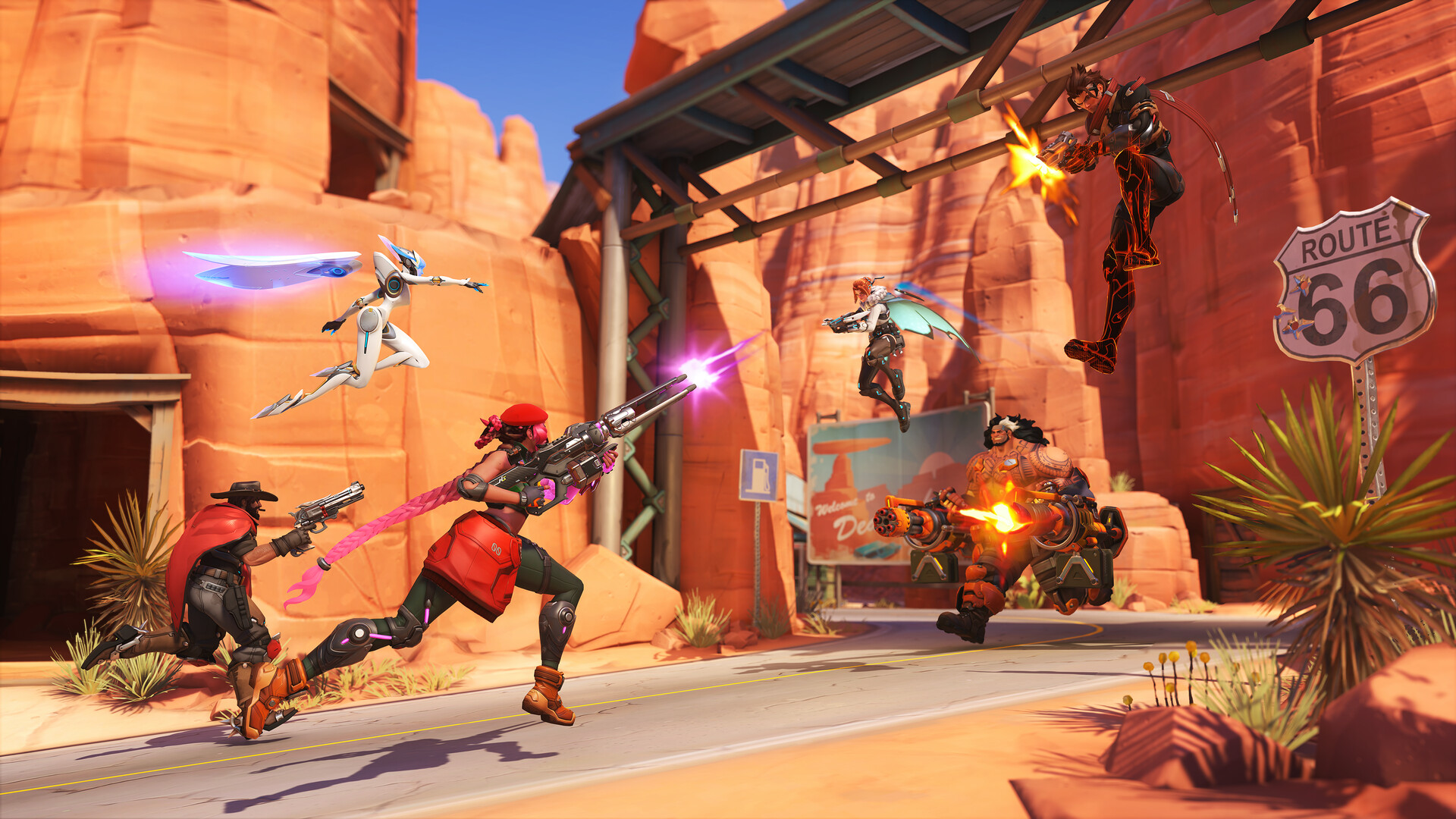
Here’s the kicker: good crossover skins live or die on little things. Think jacket lines, colour accents, prop design, and whether the final look still matches the hero’s posture and animation set. In a game like Overwatch, where characters are read in a split second, those details matter a lot.
What I especially like is when a collaboration keeps the hero’s identity intact while adding new visual flavour. That’s the sweet spot. A skin should feel like a costume, not a total reset, and YOASOBI’s fashion-forward image gives Blizzard a strong reference point to work from. Simply brilliant. See what I mean?
What this crossover says about game and music marketing
Here’s the thing: game collabs with music acts are no longer rare, but the good ones still stand out when they feel matched in spirit. Overwatch has always leaned into bright colour, character personality, and a bit of spectacle. YOASOBI, on the other hand, is sleek, modern, and highly image-aware. That makes the pairing feel natural rather than forced.
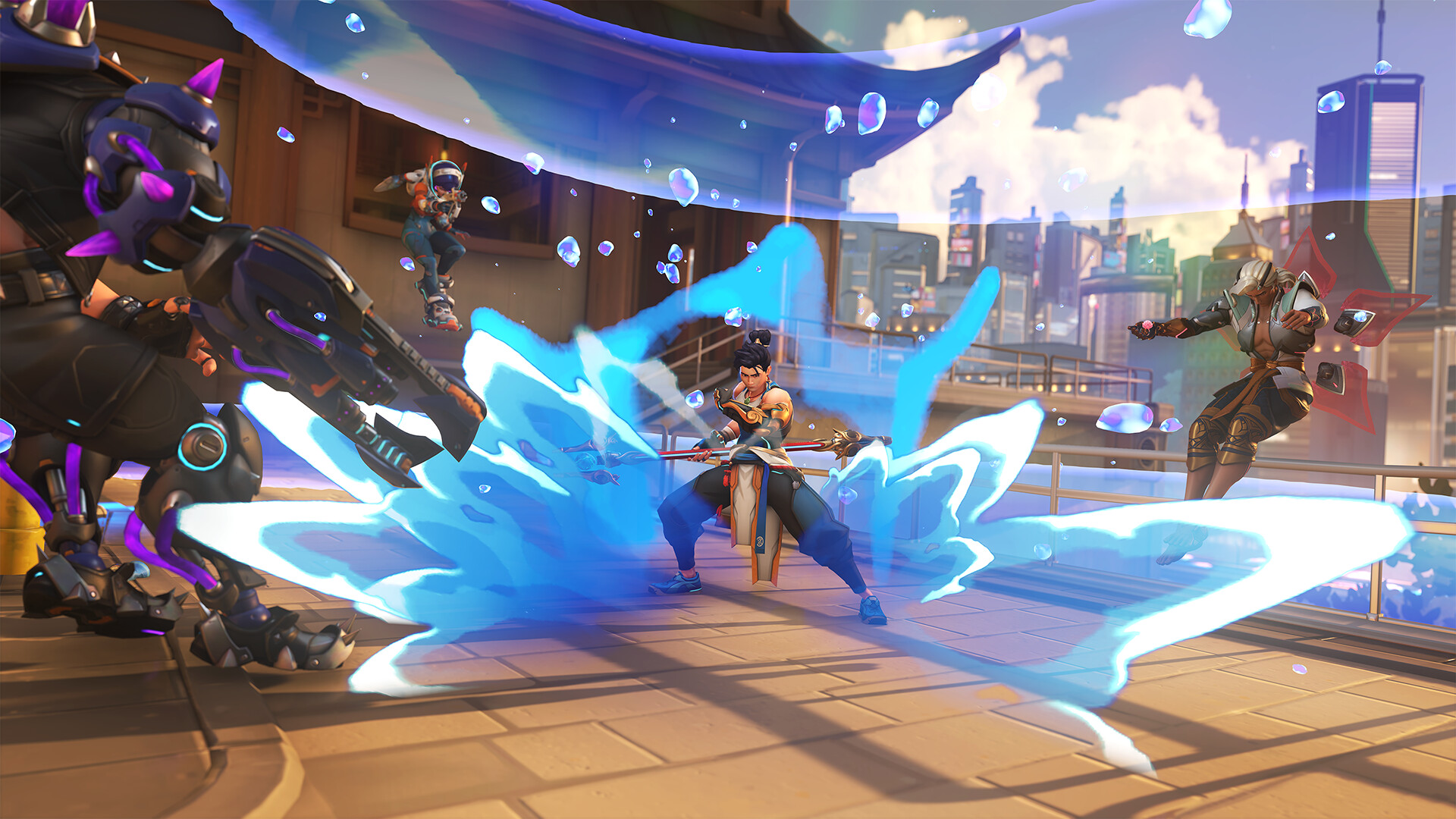
No wonder, because both sides know their audiences are online, visual, and quick to share anything striking. A six-skin rollout gives fans plenty to discuss, from favourite hero matches to the most faithful design touches. If Blizzard follows this up with themed cosmetics, event art, or limited-time promotions, the collab could keep circulating for a while. Oh, almost forgot: that kind of sustained chatter is often the real win.
My tip: if you’re a Japanese learner, keep an eye on how fan posts describe the designs. Terms like 格好いい (kakkoii, cool; stylish), 可愛い (kawaii, cute), and 渋い (shibui, subtle; understated; refined) show up all the time in pop culture discussion, and they’re much easier to remember when attached to something visual. That’s the kind of learning that sticks. Wait, there’s more.
For Japan fans, this crossover also shows how Japanese pop acts are now part of a global game ecosystem, not a side note. And for Overwatch players, it’s another reminder that cosmetics can be a proper event when the style match is strong. Not bad for six skins, honestly.
Want more coverage of Japan-related releases, pop culture, and language-friendly news? more Japan news on jpnerd.com
In pictures
Frequently Asked Questions
How many skins are in the Overwatch x YOASOBI collaboration?
There are six skins in total.
Why is this collaboration interesting for Japanese fans?
It connects a major Japanese music act with a global game, so it blends pop culture, design, and fan identity.
Is this useful for Japanese learners?
Yes, because it gives real cultural context for learning pop culture vocabulary and fan language.