Basically, this collab is doing two things at once: it’s giving Overwatch a fresh, music-driven identity and giving YOASOBI another high-profile stage beyond anime and J-pop circles. If you care about Japan-inspired style, this one’s hard to ignore.
![Dragon Ball Z: Kakarot [Master Edition]](https://s.pacn.ws/1/p/1eh/dragon-ball-z-kakarot-master-edition-908785.1.jpg?v=t8ja8t&width=400)
YOASOBI x Overwatch: a pop culture collision with real style
What most people don't know is that YOASOBI have become one of the clearest symbols of modern Japanese pop export. Formed in 2019 by producer Ayase and vocalist ikura, the duo built their name on songs that began as stories, then turned into massive streaming hits like 夜 (yoru, night) ni Kakeru. That story-first approach makes them a surprisingly good fit for gaming, where character and mood matter just as much as melody.
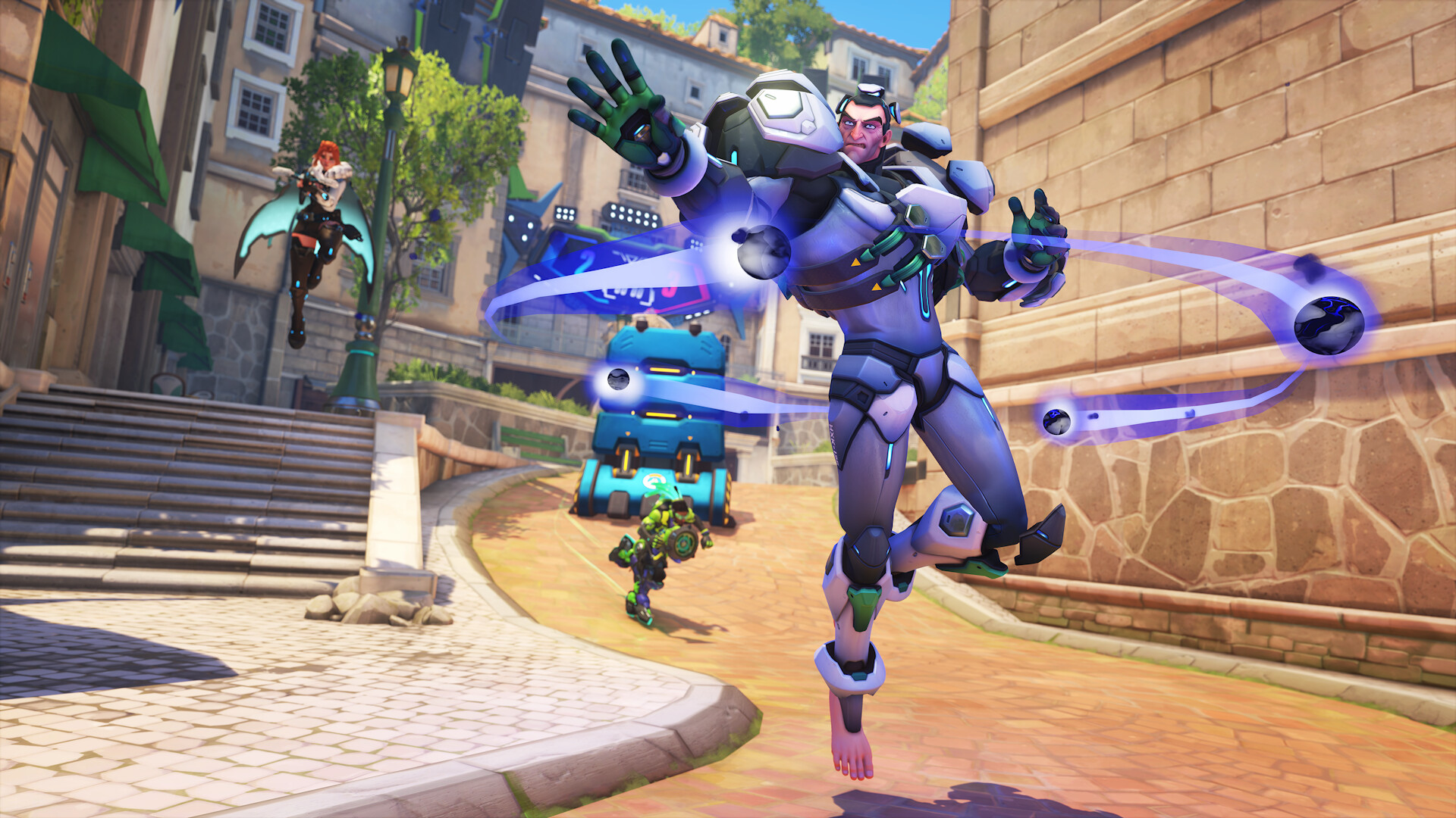
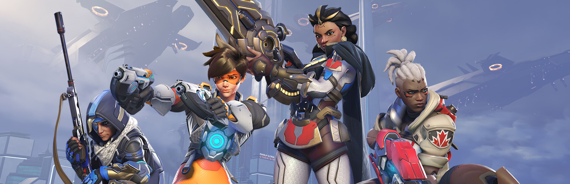
Now they’re linked with Overwatch, Blizzard’s team shooter that launched in 2016 and has spent years building a very recognisable cast. This collab leans hard into neon visuals, slick motion graphics, and a city-at-night feeling that many Japan fans will instantly connect with. Sounds weird, but it's true. The mix feels less like a random promo and more like a shared aesthetic language between Tokyo pop culture and global game fandom. Wait, there's more.
By the way, this isn’t the first time gaming and Japanese music have crossed paths, but it does feel especially polished. Overwatch has always sold its heroes through personality, colour, and short bursts of drama, while YOASOBI’s brand depends on emotional momentum and cinematic presentation. Put those together, and you get something that speaks the same visual dialect. Convinced yet?
Dragon Star Hanzo and the neon Japan look
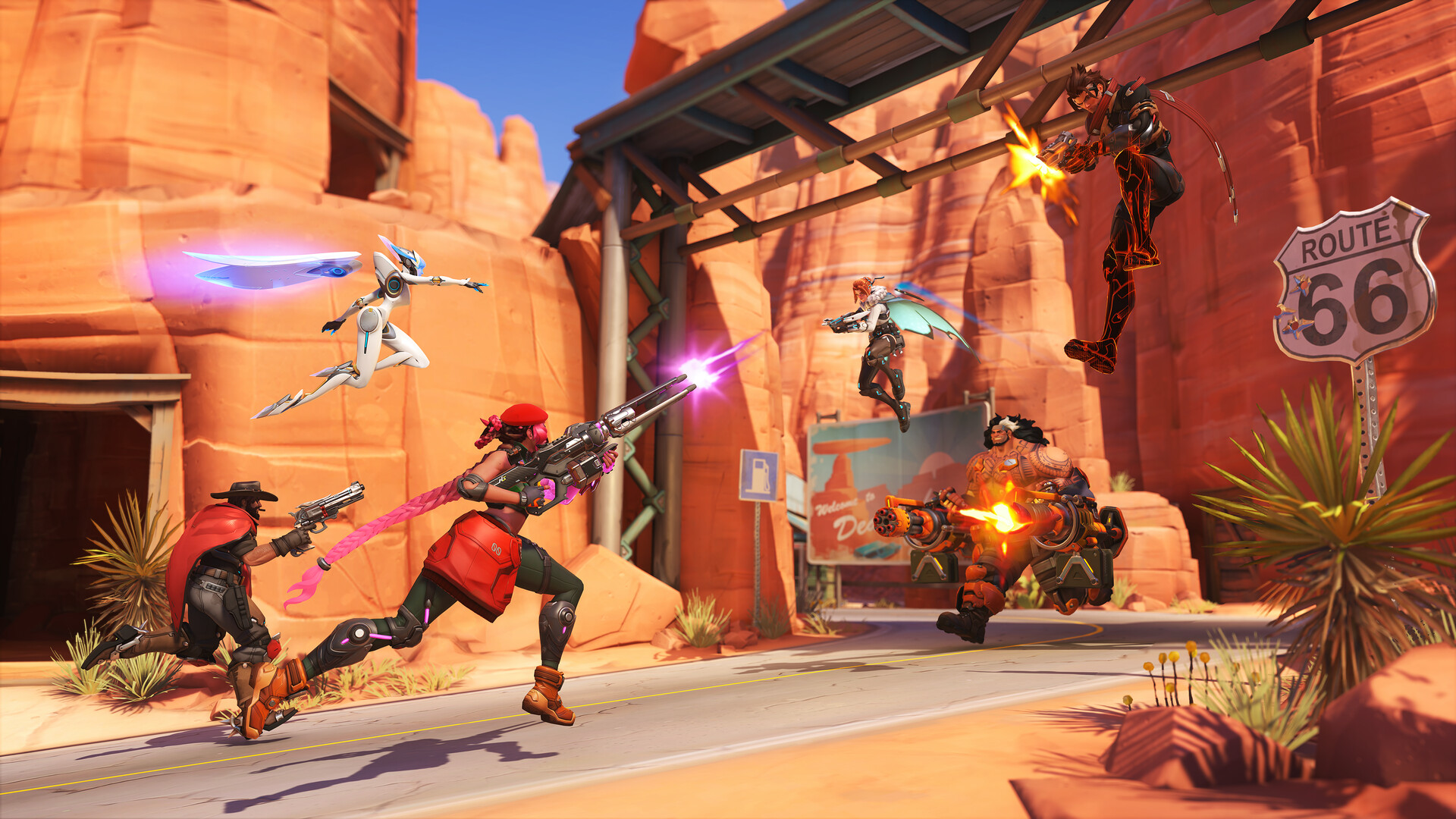
Here’s the thing: the most eye-catching part of the collaboration is Dragon Star Hanzo. Hanzo already has a strong visual identity in Overwatch, and the dragon motif ties neatly into Japanese imagery, where 竜 (ryuu), or dragons, often signal power, wisdom, and controlled force. In this new neon style, that symbolism gets pushed into a brighter, flashier space, which makes the character feel even more like a bridge between game design and Japanese aesthetics.
A great example: if you’ve spent time in Tokyo at night, you’ll recognise the feeling immediately. Imagine a narrow alley in Tokyo, lit by vending machines, パチンコ (pachinko, pachinko (Japanese gambling game)) signs, and late-train reflections on wet pavement. That same high-contrast glow shows up in the collab’s look, and it’s exactly why the concept works so well for Japan enthusiasts. No wonder, because the visual shorthand is familiar even if you’ve never played a second of Overwatch.
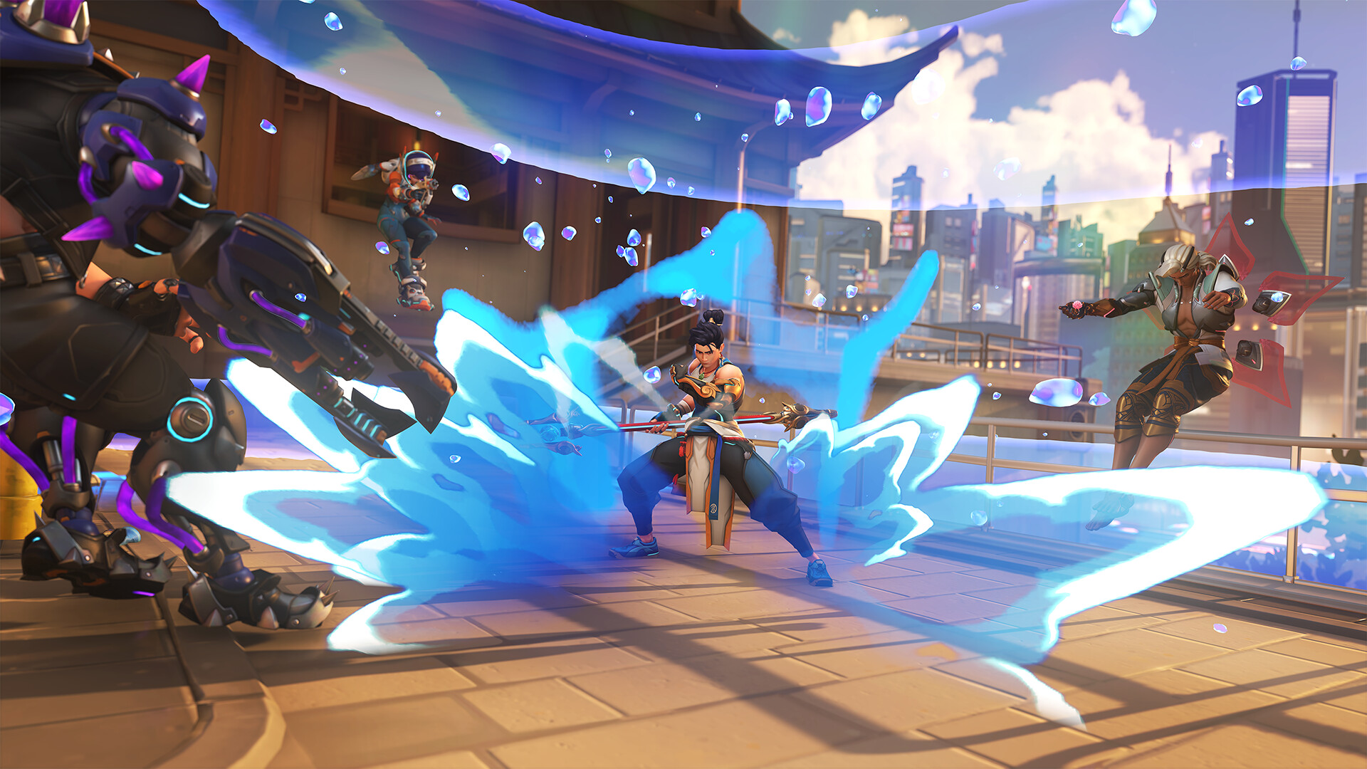
What I especially like is that the design doesn’t just borrow “Japanese-ness” as decoration, it connects to actual cultural cues. Dragons, neon, speed, city nightlife, a touch of cool detachment, all of it sits naturally inside the Overwatch universe. My tip: if you’re learning Japanese, pay attention to how this kind of branding uses cultural imagery. Words like yoru, 光 (hikari, light), and ryuu show up everywhere in pop culture, and once you start noticing them, you’ll spot patterns fast. From my experience...
Why this collab matters for Japan fans and learners
Trust me on this one: crossovers like this are more than just marketing fluff. They show how Japanese pop culture keeps moving outward, then coming back in new forms through games, fashion, and music. YOASOBI already has a strong presence in anime-adjacent spaces, and Overwatch brings in a huge international audience, so the overlap makes strategic sense as well as artistic sense.
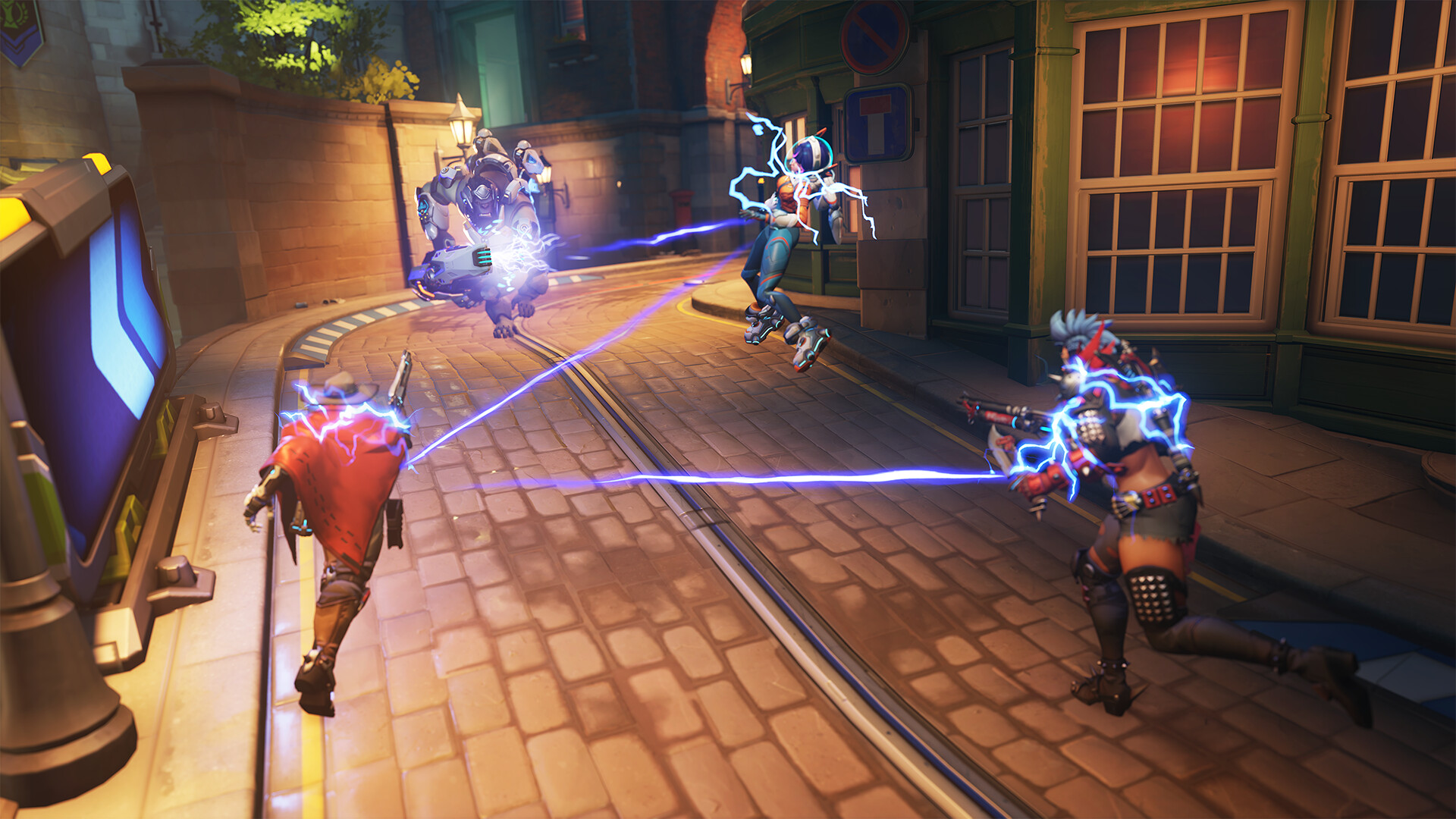
For Japanese learners, this is a nice reminder that media is one of the best ways to build vocabulary and cultural intuition. Basically, a collab like this gives you context. You see how a word, a colour scheme, or a mythic image can carry meaning without a full explanation, and that’s exactly how a lot of real-world Japanese communication works. If you know the difference between cool, loud, and refined aesthetics, you’re already reading more than just the text.
On a related note, this is also why YOASOBI keep landing in the right places. Their catalogue often feels like short fiction set to music, which is easy to adapt into visuals, trailers, and character-driven campaigns. Overwatch, meanwhile, thrives when it can attach a strong mood to a hero. Put both brands in the same room, and the result is a neon statement that feels surprisingly natural. Highly recommended: watch the collab with the sound on, not just muted stills. The music and visual rhythm are the whole point. Convinced yet?
In pictures

Frequently Asked Questions
What is the YOASOBI and Overwatch collaboration about?
It is a neon-styled crossover that pairs YOASOBI’s music-driven branding with Overwatch’s hero-focused game world, with Dragon Star Hanzo as the standout visual.
Why does this collab feel so Japan-focused?
Because it uses Japanese visual language, including dragon imagery, night-city lighting, and a Tokyo-style neon mood that fits both YOASOBI and Hanzo.
Why should Japanese learners care about it?
It is a good example of how Japanese pop culture uses imagery, mood, and story together, which helps learners build vocabulary and cultural awareness in context.
The visual design also draws heavily on kanji-inspired motifs, further anchoring the collab in Japanese culture.