Why many Shinkansen stations now show five scripts
Question: have you ever stood in Shin-Osaka or Tokyo station and felt overwhelmed by the number of scripts on the overhead signs? For non-Japanese speakers, the change can feel dramatic because what used to be mostly kanji and romaji is now often a five-way language display.
Fact: Japanese rail companies began expanding multilingual signage around the 2019 Rugby World Cup and the 2020 Tokyo Olympics, but the move accelerated after those events. That's why large stations like Tokyo, Kyoto, and Shin-Osaka now routinely include Chinese and Korean translations alongside the traditional three scripts.
Anecdote: Trust me on this one; I first noticed the full five-script stack on a Shinkansen platform at Nagoya in 2021, and I couldn't stop photographing signs. Wild, isn't it?
Direct address: If you're a language learner, you should care because these signs are a living classroom in public reading order and script hierarchy. Sounds good, right?
What the five scripts are and how each is used
Picture this: a typical Shinkansen platform sign above a staircase. You'll often see five lines, each serving a clear purpose. But let's stick with the list for now.
1. Kanji, the anchor
Guess what? Kanji (Chinese characters) still lead most signs because they're compact and carry semantic weight. For example, station names like Kyoto appear in kanji on the top line to help Japanese readers and people who recognise place names visually.
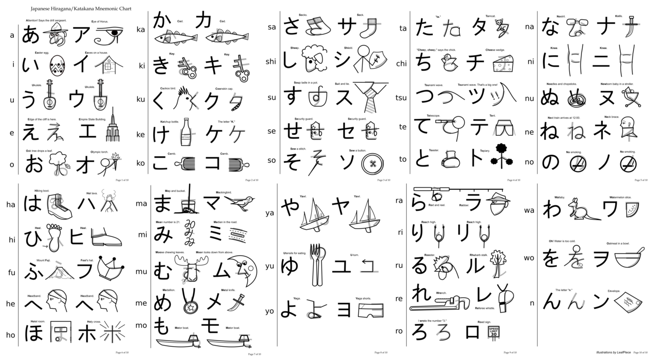
2. Kana for pronunciation and local clarity
Here's the thing: hiragana and katakana are used to show pronunciation or provide readability for children and learners. On directional signs, you'll sometimes see a small kana reading of complex station names, which helps with spoken announcements. Convinced yet?
3. Romaji for alphabet readers
While we're at it, romaji is essential for alphabet-literate travellers, and it follows romanisation standards such as Hepburn at major operators. For example, airport links and Shinkansen names use consistent romaji so apps, timetables, and English speakers match what they hear in announcements.
4. Chinese (Simplified/Traditional) for regional visitors
On a related note, most stations use Simplified Chinese for mainland China visitors, but you'll sometimes spot Traditional Chinese in areas with many Taiwanese or Hong Kong tourists. That's why Kyoto and Osaka station signage can show both scripts on different panels, depending on space. But that's not all.
5. Korean for nearby travellers
Imagine a narrow alley in Tokyo, then imagine thousands of Korean visitors heading for Hakata or Shin-Osaka. Korean translations are common on Shinkansen signs that serve major routes to western Japan because Korea is a large source of tourists, and the proximity of the countries makes Korean a practical addition. Classic Japan, isn't it?
Design, operations and the politics of script choice
Fact: space and legibility drive decisions. Rail companies like JR Central and JR East balance type size, contrast, and the number of languages because a sign that tries to show everything can become unreadable. For that reason, sign panels often prioritise kanji and romaji at eye level and add Chinese and Korean below or on adjacent panels.
Anecdote: That reminds me; during a station tour at Tokyo Station, I learned from a station manager that emergency signage standards require Japanese first, but operators may add other languages for evacuation routes. This is partially standardised across JR companies, but local municipalities sometimes add their own translations.
Direct address: If you're into train operations, note that digital displays can rotate messages, so multilingual text isn't always simultaneous. That's a pragmatic solution when physical space is limited. But that's not all.
Personal opinion: My tip is to pay attention to the script order when you study Japanese because sign hierarchy shows what native readers prioritise. What I especially like is seeing kana next to kanji on a busy platform; it's one of the best real-world grammar lessons you can get. Convinced yet?
Practical tips for language learners and travellers
Question: how should you use these signs to level up your Japanese? For starters, match kanji names to romaji on each sign and create flashcards with the pairings. For example, look at the kanji for station on signage and note the kana reading too.
Fact: apps like Google Maps and Hyperdia use romaji and kanji together, but they won't teach you reading order. That's why practice at real stations matters.
Direct address: When boarding a Shinkansen, always check both the platform sign and the train car signage. For international travellers, the Chinese and Korean lines are handy shortcuts to confirm destination names when romaji is abbreviated. Sounds good, right?
Frequently Asked Questions
Why do some stations show five different scripts?
Short answer: to serve diverse passengers: Japanese readers, learners, and tourists from China and Korea, while keeping romaji for alphabet-literate travellers.
Will the extra scripts make signs harder to read?
Short answer: not usually, because designers prioritise legibility and often separate languages onto different panels or rotate messages on digital displays.