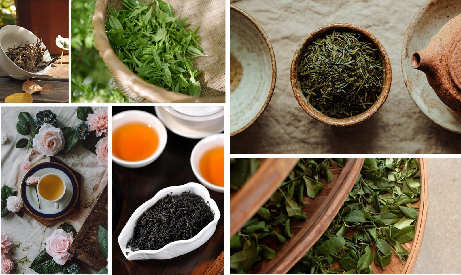
Rather than screaming for attention, the new presentation leans into self-reflection, calm design, and the sort of quiet confidence that 抹茶 (matcha, grüner Teepulver) has always had, even when the rest of the world treats it like the latest green miracle. Classic Japan, isn't it?
Zenkyu Matcha’s new look arrives on 2026-08-12
Zenkyu Matcha will debut its new branding and packaging on 2026-08-12, and that date matters because this isn't just a label tweak. According to the original report from Predge, the brand is preparing an international launch built around a clearer visual identity and a more reflective concept, which is a rather elegant way of saying, “we’d rather be contemplative than noisy.”
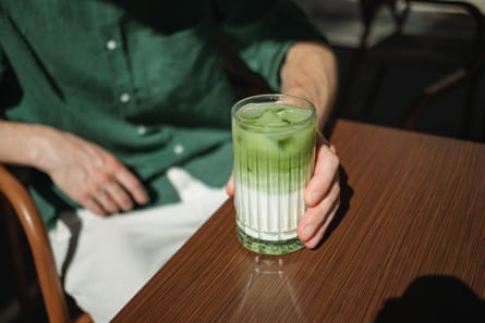
The refresh matters because matcha is no longer just a domestic Japanese product sitting quietly in the corner of the tea world. It has become a global category, served in cafes, bottled drinks, and all sorts of places where tea used to know its place. So when a brand like Zenkyu Matcha rethinks its packaging, it is doing more than choosing a nice green box. It is deciding how Japanese tea should speak to an international audience, and whether that voice should be polished, playful, or quietly assured. Here's the deal: Zenkyu has chosen the latter.
Packaging that moves from product shelf to self-reflection
What most people don't know: packaging in Japan often does more than contain the thing inside. It frames the mood, the price point, the occasion, and sometimes even the moral character of the buyer (a bit much, perhaps, but there we are). Zenkyu Matcha’s new branding appears to lean into that Japanese habit of turning an ordinary purchase into a small moment of thoughtfulness.
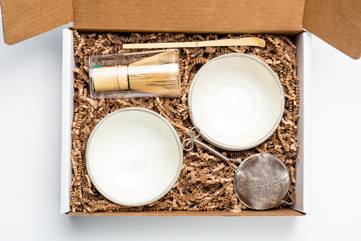
Instead of competing for shelf attention with loud graphics and “pick me” energy, the new look is described as self-reflection rather than product-regal display. That makes sense for matcha, which carries a built-in sense of ritual. Matcha is shade-grown, finely ground green tea powder, and in Japan it sits somewhere between daily habit and ceremony. You can use it in a whisked bowl at home, in a latte from a cafe, or as part of a more formal tea setting, and each of those lives sits under the same green umbrella. Not bad, right?
Why this fits matcha so neatly
Did you know that the Japanese word itself, matcha, is one of those terms learners meet early because it travels so well? It has become international without losing its Japanese identity, which is more than can be said for a lot of borrowed food words, frankly. For Japanese learners, this makes the category useful linguistically too: it connects to tea culture, ritual vocabulary, and the broader idea of 間 (ma, Zwischenraum; Pause), the space and pause that Japanese design often leaves behind.
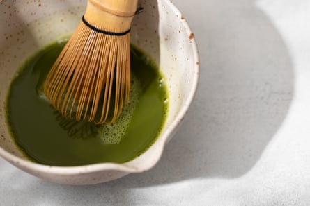
And that is why this packaging refresh feels credible rather than cosmetic. A brand selling matcha can either treat the product as a lifestyle accessory or as something with cultural weight. Zenkyu Matcha seems to be aiming for the second, which gives the launch a bit more substance than a simple rebrand for the sake of a new font. Wait, there's more.
What the international launch says about matcha right now
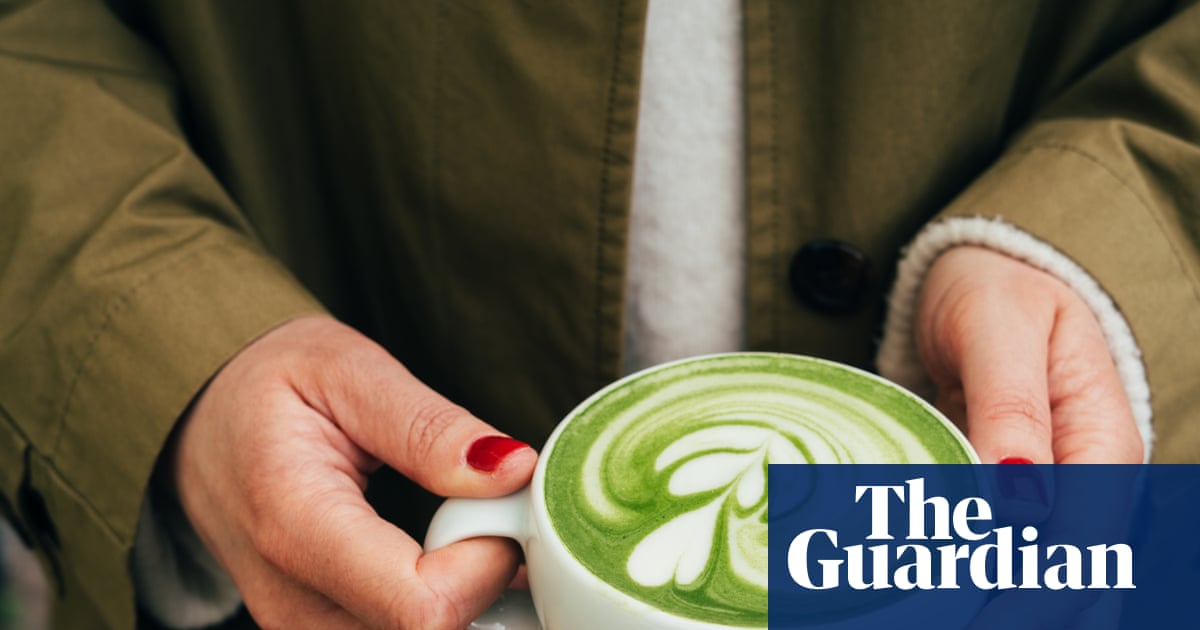
On a related note: matcha’s global rise has been building for years, and brands now have to think beyond Japan’s borders from the outset. You can see that in cafe menus, grocery shelves, and the sheer number of drinks that now contain some shade of green and a claim to calm. A recent piece from The Guardian noted a 133% increase in matcha orders in Australian businesses, which gives you a sense of the scale, even if the green beverage mania can feel a bit much at times.
So Zenkyu Matcha’s packaging refresh lands in a market that is already primed, already curious, and already slightly obsessed. That means the design has to do real work. It needs to communicate origin, quality, and mood in one glance, while still feeling usable in Tokyo, Sydney, or wherever else people are currently whisking a bowl before deciding they are a wellness person. My tip: when a Japanese food brand goes international, the best packaging usually says less, not more. Japanese restraint tends to travel better than slogan soup.
Hand on heart, that is one of the reasons Japanese food branding remains so enjoyable to watch. It can be deeply modern without losing the sense that food is a relationship, not just a transaction. And if Zenkyu Matcha can make “self-reflection” feel as natural as buying a tin of tea, that is quite a neat trick. From my experience... or rather, from watching this market long enough to know when a brand is on the right track, that is the sort of design direction worth paying attention to.
Frequently Asked Questions
What is Zenkyu Matcha launching?
It is launching a new branding and packaging concept, with an international rollout set for 2026-08-12.
What is different about the new packaging?
The new look shifts the brand away from ordinary shelf-style presentation and towards a more reflective, calm visual identity.
Why does this matter for Japanese learners and Japan fans?
It shows how Japanese food branding uses design, mood, and cultural ideas like ritual and restraint to communicate meaning beyond the product itself.